BRAND STRATEGY & DESIGN
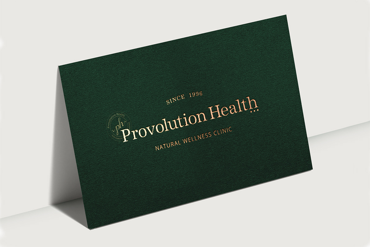
Provolution Health is a respectable chiropractor clinic in Queanbeyan, Australia, well known for its highly professional approach and powerful holistic principles delivered with wisdom and compassion. Dr Marcus Chacos (Chiropractor) sought to establish a multidisciplinary facility that offered a comprehensive approach to health that involved the natural principles of wellness by looking at diet, exercise, emotional wellbeing and the body’s structure. We wanted to capture the concepts of 'timelessness' and 'trust', visual indentity that would reflect development of the clinic.
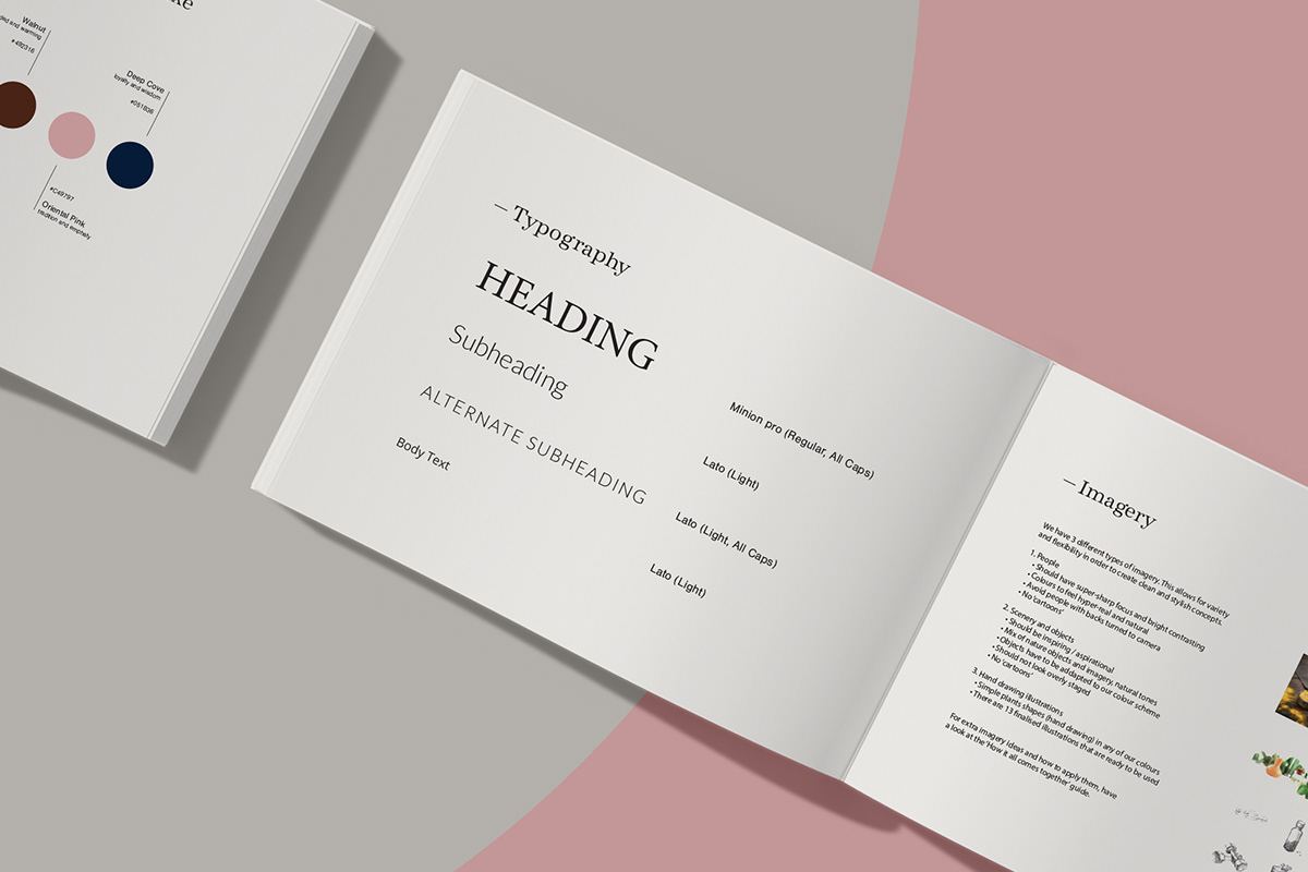
The classic serif typeface speaks with a voice of trusted authority.
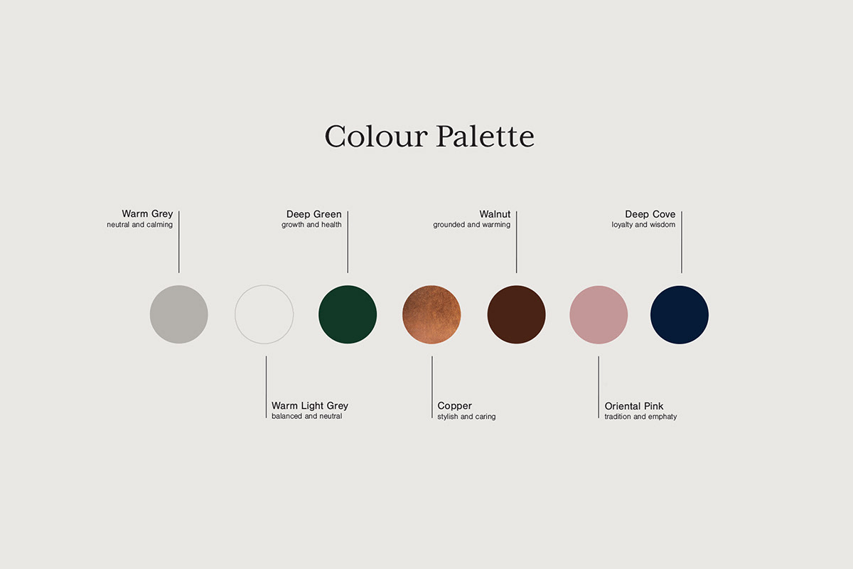
With a chosen color palette, we wanted to create a visual identity that directly communicates brand positioning. Deep green leads as a symbol of growth and health.Colour accents are warm, natural, and a little luxe. They consists neutral calming greys, grounded and warming walnut brown, copper which is stylish and caring, the oriental pink symbol of tradition and empathy, and deep cove blue depicts loyalty and wisdom.
Brand elements are clean and uncomplicated, reassures clients that it stands firmly, while the results do the talking.
Special attention is paid to the choice of materials and the way of printing. Uncoated paper stocks paired with foil stamping in print material for a personality that is approachable with a touch of luxe.